20 Years of Stories: How Rhythm Found Its Steeze
And before you suggest it, we’ve been doing this lonnnngggg before the bots took over and AI art became a thing. So no, we aren’t just inputting prompts into an AI engine.
The answer you’re looking for is Mike Shankster, or as we all know him, 'Shanks'. Jindabyne-based mural artist, certified shredder, and former Niseko local, Shanks has always been part of the Rhythm family – even working the shop floor of Rhythm Summit (then ‘Rhythm Main St’ ) back in the day.
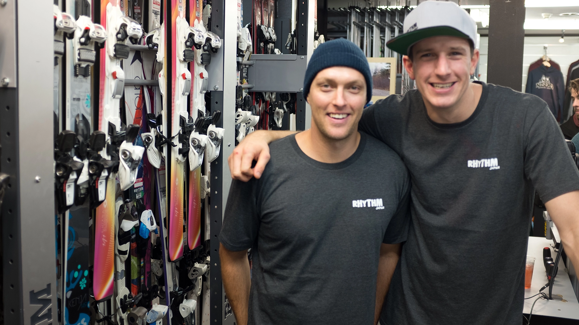
Having initially decided to chase winter in Japan after taking a sabbatical from his background in advertising, the '09 season offered Shanks a chance to reset, smash some pow and experience both Japanese culture and Niseko as an emerging ski resort.
But as we all know, snow seasons always have a way of changing plans. Meeting crew from all over the world, job offers to other resorts, chances to head on off-season surfing trips or safaris with other seasonaires you’ve befriended – winter seasons just have a way of presenting new and exciting opportunities. For Shanks, that’s exactly what happened, with his winter reset turning into a now near two-decade long journey that he never saw coming.
“I’d come from an advertising background and was having a break during the ski season. But towards the end of the season, I had an opportunity… I got to design a poster. Just a little robot poster to put up around the store.”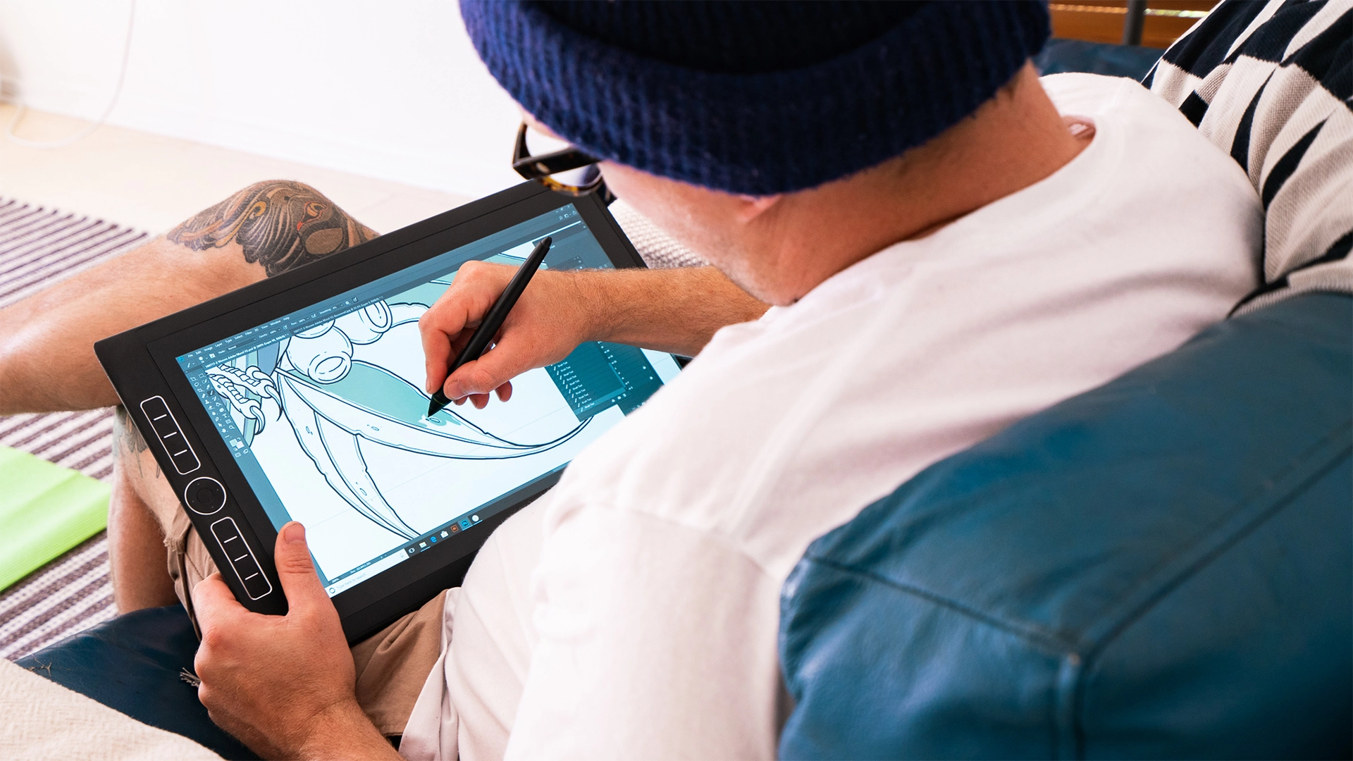
Yes, he’s talking about that robot. If you know Rhythm, you’ll know the ‘robot’ we’re talking about– an immediate identifier of the brand, reincarnated over the years in different formats, but always remaining ‘The Rhythm Robot.’ 
“It’s a good little mascot,” reflects Shanks. “I really didn’t intend for it to become as big of a mascot as it did.”
“Back then, it was just a promotional A3 we’d run around town, then it morphed into a Rail Jam version and the rest is history. There was no real meaning behind it – I was doing my first winter in Japan and a robot felt synonymous with Japan. Then over the years, it’s taken on a life of its own.”
Sometimes that’s all it takes. Just like that, Shanks’ winter season away from home and one little robot ushered in a whole new era as a full-time artist.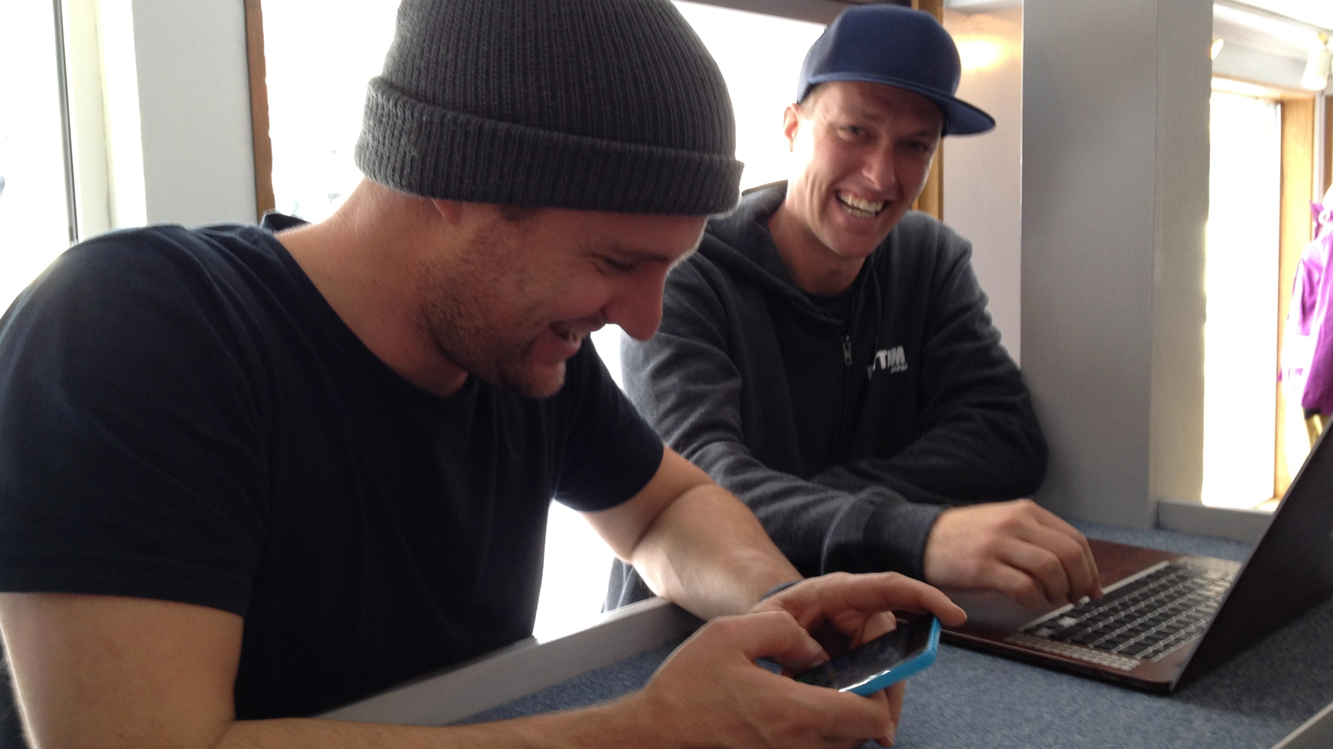
“I spent three back-to-back winter seasons working in the store, riding pow, having fun – I absolutely loved it, Niseko is a unique and special place. Then over summer, little bits of design work would popped up.”
“OYUKI had started around then too, so I helped with packaging and getting that visually off the ground. It was simple back then – wall prints, DLs, physical marketing, a bit of website stuff. As the brand grew over eight years, smaller projects started getting outsourced, and I’d come in for significant ones.”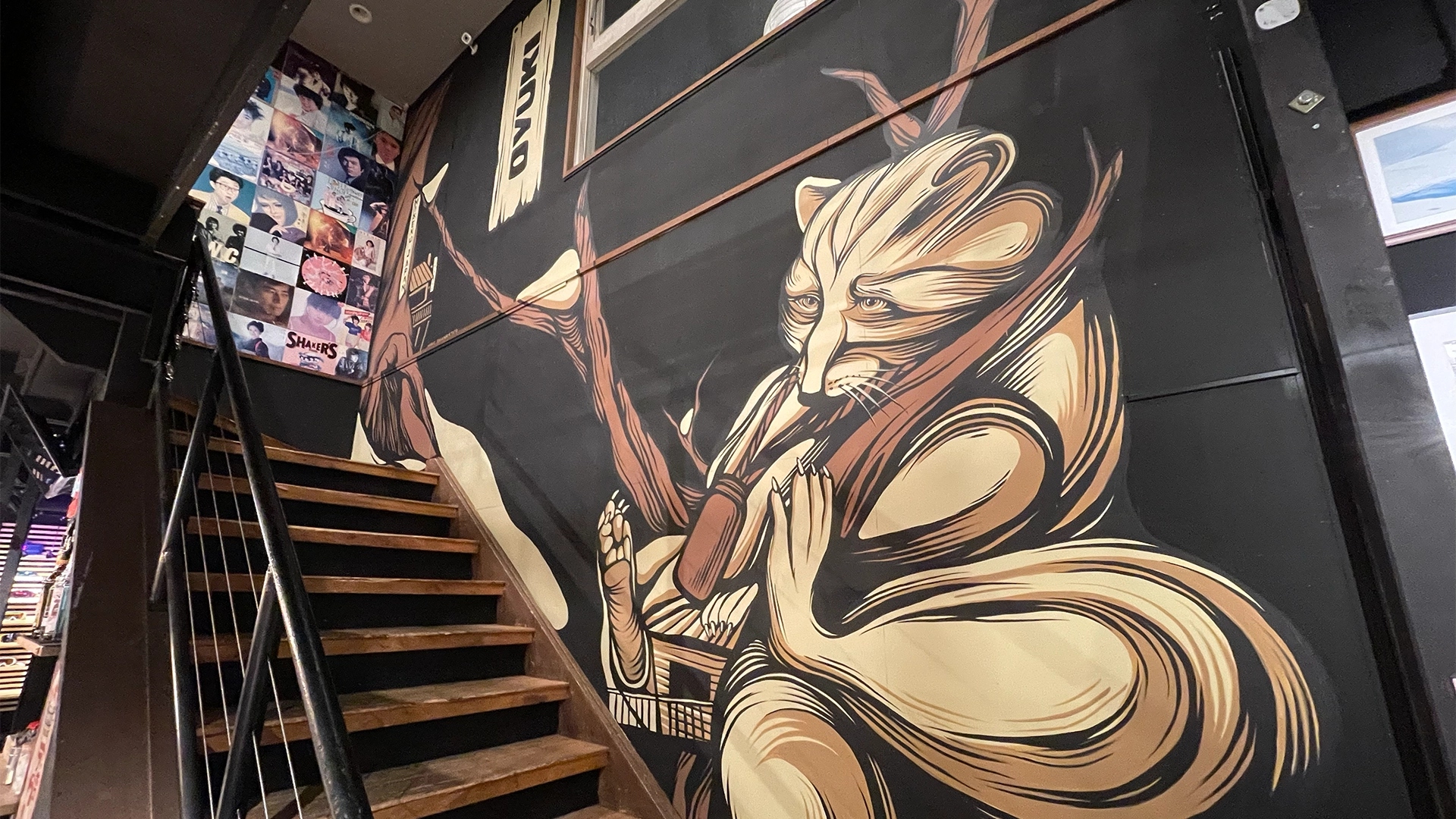
Working across multiple touchpoints and brands, Shanks spoke on his initial designs, touching on the inspiration behind them by stating, “the environment, landscapes and Japanese culture all played a part.”
“I was also really into heavy metal and punk album covers – a lot of Ken Taylor, Frenzal Rhomb’s ‘Meet the Family’, Death’s 'Spiritual Healing' – that kind of lowbrow cartoony style, that’s what I was going for, and it just stuck. It’s shifted over time, elements have stayed the same but it’s really grown into its own ‘Where’s Wally’ (Where’s Waldo) style.”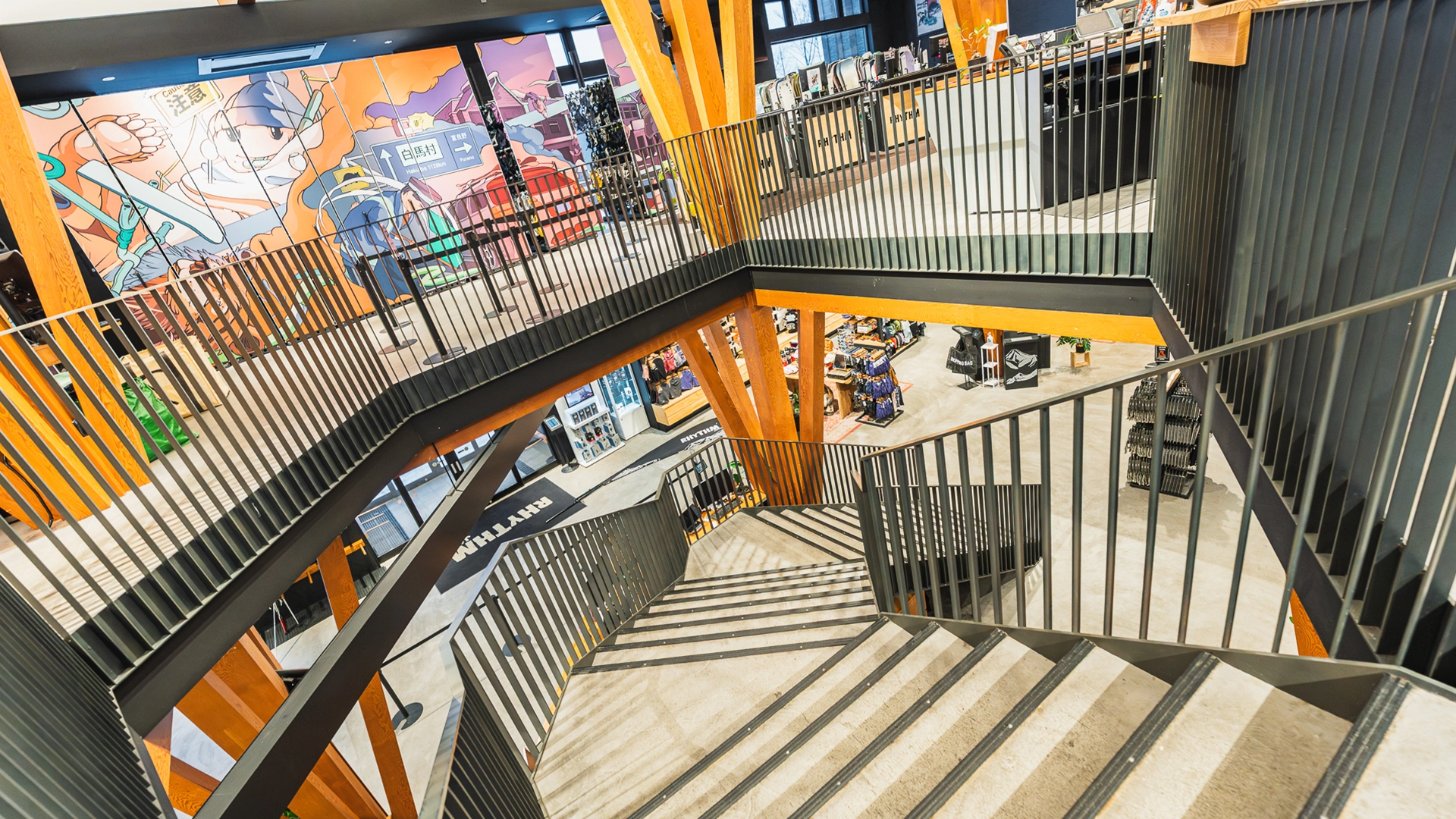
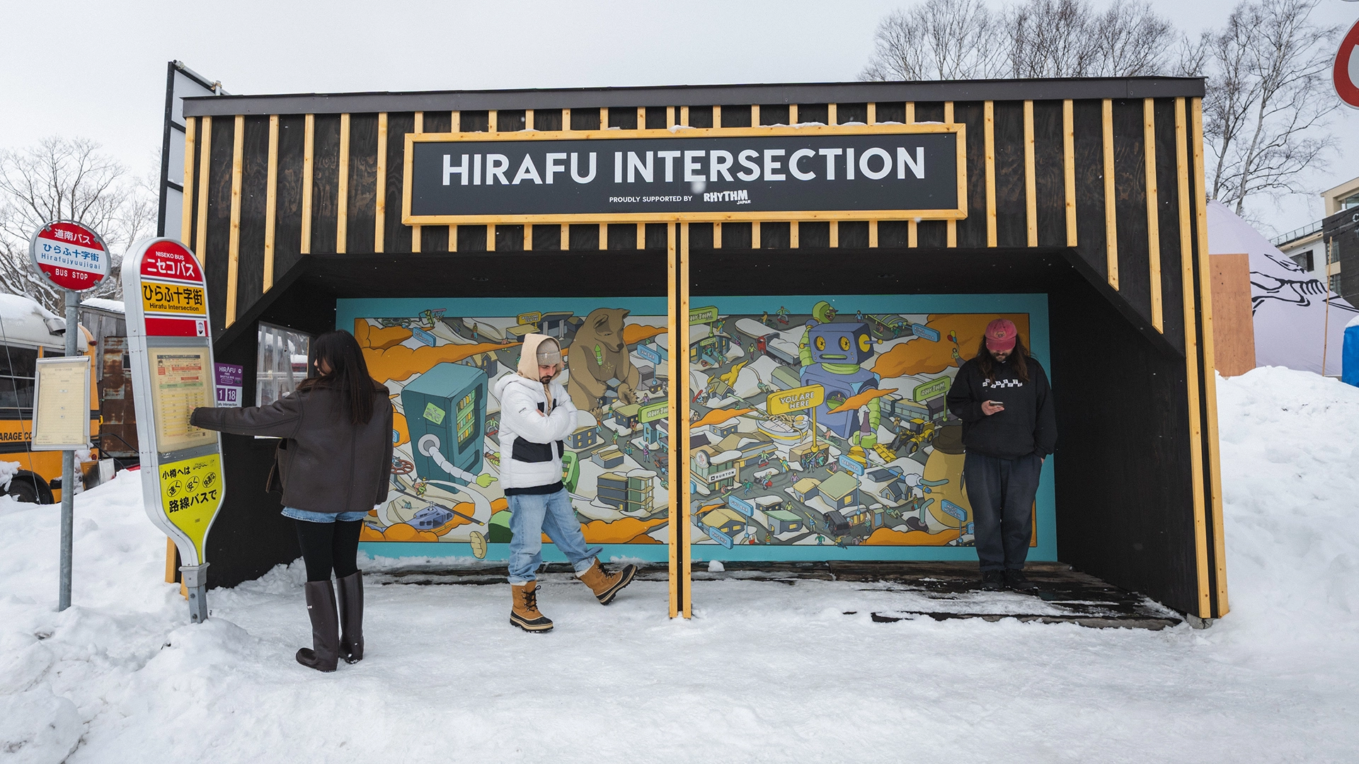
If you’re unsure what he means, think of our iconic ski racks – metres and metres of overlapping illustrations, all layered with stories that subtly tie our brand history together.
Initially created for Rhythm Hirafu, it’s a style that lets you pack in both story and detail, while also looking pretty darn epic.
“I didn’t think about space much in the early years, but now it’s one of the first things I address – how it flows with the space, colours and simplicity. Detail comes last. Story and composition come first.”
Which is to be expected given the amount of stories all tied into the one piece, but when you’re working with 20 years of stories, how do you even begin to tie that all together?
“I normally send out an email chain to get stories. Then you’ve got the prerequisites – all the stores, the branding - and then I start drawing. You’ve normally got 20 ideas, you put in what fits, and usually the better ideas come out while you’re drawing.”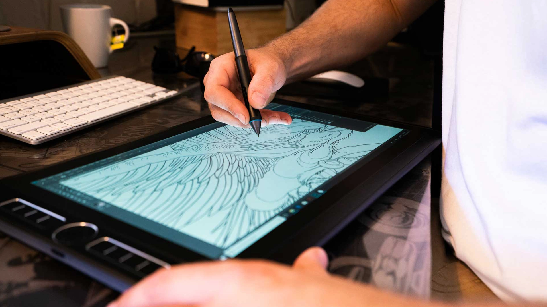
“That being said, these last designs were difficult. I put a lot of pressure on myself with it being the 20-year artwork, as well as signing up to design both the anniversary skis and snowboards and a new ski rack.":
"It was also hard to fit everything in, there were just so many iconic stories – Sachi and Tomi singing ‘UFO’ at karaoke, waking Eddy at 3am blasting Slayer outside his door, the forever ramen worker, Hitoshi’s Barunbar BB antics. I wanted to tell them all.”
“But seeing it now… it makes it all worth it. I think you’ll all love it when you see it.”
Unfamiliar with Shank's art? Head in-store and check it out!

